
Hanging Photographic Exhibitions
THINGS YOU NEED TO CONSIDER
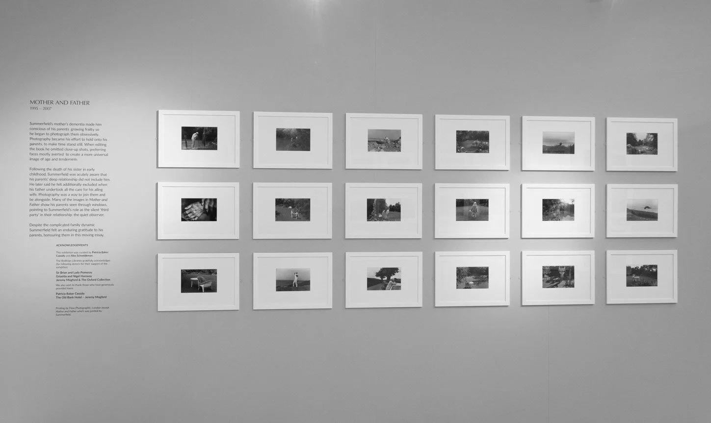
Paddy Summerfield, The Camera Helps, at the Weston Library during Photo Oxford 2025. Photo: Alex Schneideman
You’ve built a body of work, found an exhibition space and carefully selected what to show. Now you’ve just got to hang it. It sounds simple but the hanging scheme shapes how viewers move through your work, what story they read into it, and whether individual images get to breathe or have to fight for attention.
Choosing how best to hang your work isn’t always easy. To help with those decisions, we’ve compiled a guide to the most common curatorial styles, and what you need to think about before choosing how to hang your exhibition.
Start with the narrative
Before you ever arrive at the gallery, decide what it is you want people to feel as they move through your exhibition. Should the show feel formal, playful, archival or conceptual? What’s the context for your body of work? Do your images follow a chronological journey, are they thematically grouped, or a series meant to be read as one continuous piece? A documentary project following one subject over time may work best hung in a single row, while a body of work exploring a theme from multiple angles might suit a salon-style hang that lets the eye wander and make connections. Thinking about your artistic intent long before install day will help enormously when deciding how to hang your work.
HANGING STYLES
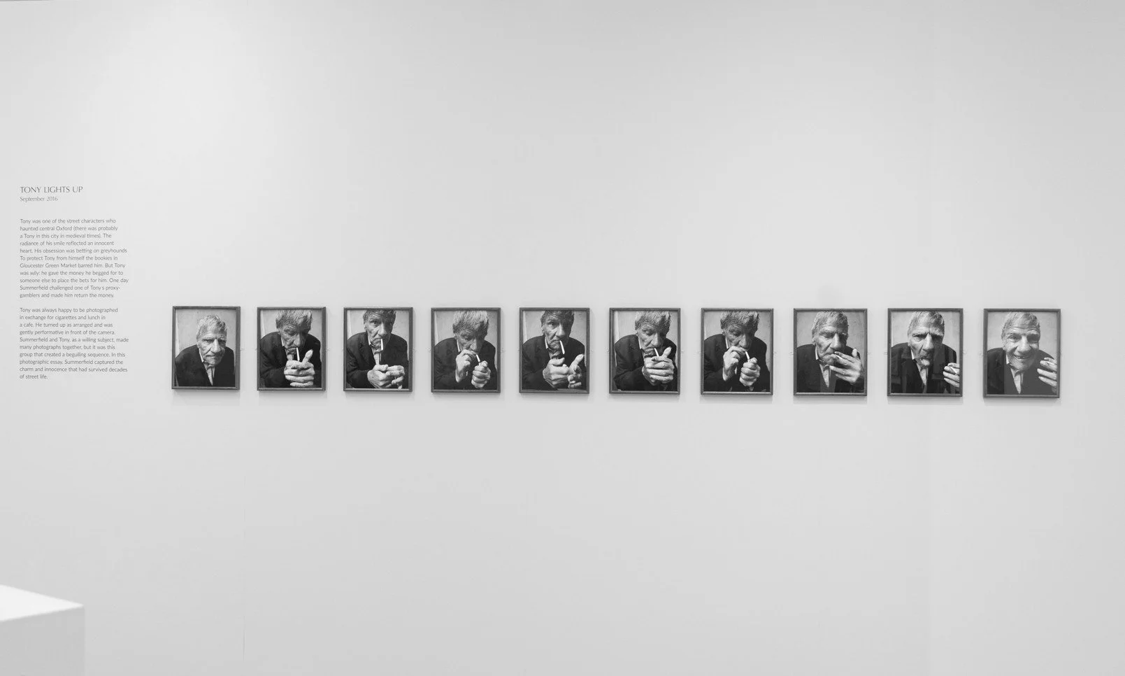
LINEAR HANG
The classic gallery approach is to hang works evenly spaced and at a consistent height, typically around 145-160cm from floor to the centre of each image. It's clean, calm, easy to navigate, and lets each photograph stand on its own. It works well for a cohesive series with consistent sizes or themes where you want no single image to dominate, but may feel too rigid for experimental or conceptual work.
Paddy Summerfield, The Camera Helps, at the Weston Library during Photo Oxford 2025. Photo: Alex Schneideman
GRID HANG
A structured, geometric layout where works are arranged in rows and columns with uniform frames and uniform spacing works well for series that rely on subtle variation. It creates a strong visual impact and is great for conceptual series which may benefit from the repetition in the pattern and the comparison the structure provides. It requires exact alignment and spacing however, any inconsistencies will become glaring obvious.
Paddy Summerfield, The Camera Helps, at the Weston Library during Photo Oxford 2025. Photo: Alex Schneideman

SINGLE STATEMENT PIECE
One photograph given an entire wall creates a powerful visual anchor that draws viewers closer. It signals importance and confidence while allowing viewers to slow down and engage deeply in an immersive way. To make this bold statement hang work, you need a visually commanding image that can hold its own on close inspection, and often works best when supported by the exhibition’s narrative.
William Eggleston by Rosalind Fox Solomon at Photo London. Photo: Etain O’Carroll

STAGGERED HANG
If you’re looking to add visual flow to your exhibition, a staggered hang where works are hung at varying heights to create a sense of movement, may work well. It breaks the formality of a liner hang and helps to guide viewers through a space, but needs careful consideration and intentional spacing to avoid looking random.
Work by Ute and Werner Mahler at Photo London 2026. Photo: Etain O’Carroll
SALON HANG
The salon hang takes the staggered look a step further, hanging many works together in a dense, floor-to-ceiling arrangement. Inspired by 18th–19th century European salons, it creates visual drama and encourages close looking, and works well with images of mixed sizes, but it can also overwhelm more subtle images. Hanging salon style requires careful balancing of visual weight, colour, and negative space so it doesn't read as chaotic. It usually works best when there is some form of unifying theme, colour palette, or frame style.
CLUSTER HANG
Another variation on the staggered hang, this looser, more organic arrangement where works are grouped in small clusters with intentional gaps is useful for breaking up a large space. It also allows you to create narrative “chapters” within a show, easily assimilating frames of mixed sizes in a dynamic style. However, you’ll need a clear visual logic (colour, theme or subject) to prevent it feeling messy.
PICTURE LEDGES
Rather than hanging, it may be worth considering picture ledges for your install. If you have a large number of smaller images and wish to create a more relaxed, tactile experience, resting your images on shallow shelves may be an option. It’s easy to rearrange at any time, but visitors may interpret this format as an invitation to handle your work, so you need to be clear about expectations.
Practical considerations
Sightlines and eye level
The standard is to centre work at eye level for an average adult (around 145-160cm), but consider your actual audience and venue. A children's exhibition, a space with a lot of seating, or a room people view from a distance all shift that number.
Spacing
Consistent gaps read as intentional; inconsistent gaps read as accidental. As a rough guide, 5-10cm between images in a line hang feels tight and connected, 15-20cm feels more contemplative. Larger prints need more surrounding negative space than small ones.
Print size variation
Mixing sizes adds visual interest but needs discipline. Even an eclectic hang need a unifying logic and too many different sizes in one run can feel unplanned. Consider grouping by size zones or choose a maximum of two or three frame sizes and repeating them.
Wall length and room flow
Map the room before you commit. Mock-ups, floor plans, and paper templates are your friends. Where does the visitor enter? Where's the natural end point? Corners, doorways, and windows all interrupt a hang and need to be planned around, not discovered on installation day.
Lighting
Your hanging scheme has to survive the venue's actual lighting conditions, not the ones in your head. Check for glare on glazed frames, uneven spot lighting that draws the eye unevenly, and whether darker or high-contrast images need different placement than lighter ones to hold their tonal range.
Framing and mounting consistency
Uniform framing lets the images do the talking and unifies a mixed-size hang. Deliberately inconsistent framing can work but should be a considered choice.
Wall colour and material
Evaluate how your prints actually look against the specific wall. Colour casts from paint, texture from brick or plaster, and even the sheen of the paint can shift how a photograph reads.
Text and labelling
Decide early whether captions sit beside each image, are grouped on a separate panel, or are omitted entirely. This affects spacing and where people's eyes stop to read versus keep moving. For more on this see our labelling guide here.
Scale relative to the room
A hanging scheme that looks great in a mock-up on your studio wall can feel cramped or sparse in the actual venue. Where possible, do a physical or taped-out mock-up on-site before final printing.
The best hanging schemes are usually the ones viewers don't consciously notice but whatever you decide to do, make it intentional.