Labelling your photos
What Every Photographer Needs to Know when exhibiting their work
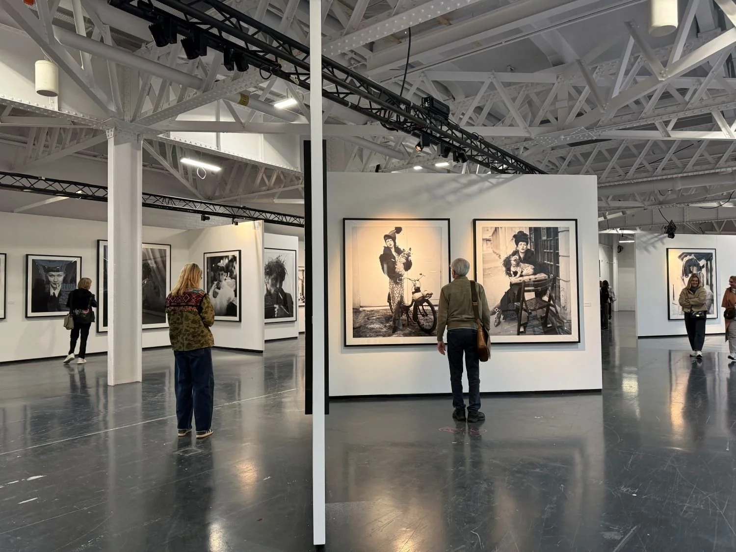
Photo London 2026. Photo: Jane Smith Media
Labelling your photographs professionally is important to get right. Labels help viewers understand what they’re looking at, offer clarity and show professionalism, and can be key to starting a conversation with a potential buyer or collector.
Here’s our guide to all you need to know.
Name
This might seem obvious but there is no harm in including your name, even if the work is part of a solo show. You can decide if you want to include more information, such as your year of birth or country of birth – sometimes this is relevant and adds value to the visitor’s understanding of your work.
Title
A title is often the first point of connection between your viewer and your image. It can guide interpretation, deepen emotional impact, or simply anchor the work in place and time. Titles live forever in catalogues, sales records, and archives, so try to choose something you won’t want to change later.
You also need to think about how collectors and curators may search for your work online, a clear title can help them find you and your work quickly and easily. This doesn’t mean that the title needs to be descriptive and it might be the case that you want your work to be Untitled, which is fine. But even so, giving that information and then a series number will really help future collectors and curators.
Medium
The medium line on your label tells viewers exactly what they’re looking at - and signals the value and craft behind it. Collectors want to know the materials and process. Galleries need accurate information for insurance and cataloguing, and different mediums imply different levels of permanence and value. Be specific, and include the paper type if it’s part of your artistic choice but otherwise you don’t need to.
Common photographic medium descriptors:
Archival pigment print
Silver gelatin print
Chromogenic (C‑type) print
Inkjet print
Giclée print
Editioning & Numbering
Editioning is one of the most misunderstood parts of photographic practice and one of the most important for building trust with collectors. Editioning is a promise and a guarantee. Once you set an edition, you can’t expand it later without damaging your reputation and your gallery needs to honour your editions as well.
Thing to consider:
Edition size - Common ranges are 3, 5, 10, 15, or 25. Smaller editions = higher value. Many photographers are under the misapprehension that they will sell more if they make larger editions. Beware of this thinking as it is often the exact reverse – you want to sell out, not be left with open editions that are unsold as this devalues your work and your reputation.
Print sizes - Decide whether each size has its own edition (e.g., 5 editions at 16×20", 10 editions at 8×10"). You need to think about the number of different sizes that you are offering – again, less is often more and it is best to limit sizes to two at the most.
Artist proofs (APs) - Typically 10% of the edition, not for general sale. You own these, not your gallery, and so you need to consider when and how you want to sell them when the main edition is sold out. Often artists reserve the APs for museums or institutional collections.
Label format - Usually written as 3/10 (third print in an edition of ten).
Certificate/label – You should offer to sign the verso of your editioned prints, in pencil and also sell each one with a piece of paper (can be small) that includes all relevant information about the print ie name, title, medium, date of print and edition number.
Edition Chart
Future proof your career and keep a record of each buyer’s names, sale date, edition number and location of sale.
QR Codes
There’s a growing trend to provide QR codes instead of labels, but as the old adage goes, you only have one chance to make a first impression. Don’t put the onus on the viewer to go looking for the most basic of information. Provide it on a clear, professional label and use the QR code to add extra depth. Place the QR code on a secondary label or wall card, not the main artwork label.
Your QR code could link to:
A behind‑the‑scenes video
A short artist statement
A purchase page
A full series overview ie the rest of the series
Your wider portfolio or Instagram page
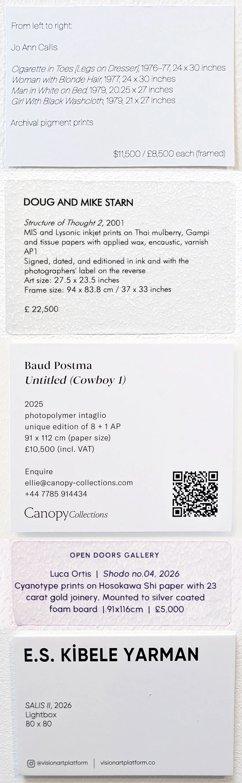
Some label examples from Photo London 2026
What should you include on your exhibition label?
· Artist name
Title (italicised)
Year created
Medium
Dimensions (unframed and framed if relevant)
Edition size
Price (optional, depending on venue) – this could be unframed and framed price and should be clear on the relevant taxes
Label design
Use a clear, clean, readable font (Gill Sans, Helvetica, or similar)
Maintain a cohesive style on every label, and align it with the exhibition branding if possible
Leave space around the text to let it breathe
Make sure your labels match the information on your website and sales listings
Keep a folder on your computer of all your labels so they’re easily accessed when you next need them
Label placement
Place your labels at a uniform height, to the side of your artwork and ensure that they are level. Use temporary, non-damaging adhesives, and if you’ve chosen to hang your work salon style, use a single sheet with a clear and easy-to-follow numbering pattern to provide the details on each piece.
When done well, labelling elevates your work, spend the time getting it right. It should look effortless and that takes wo